Introduction
In the vast realm of web design, creativity knows no bounds. In this blog post, we will delve into the enchanting world of the flashlight effect, a unique and captivating visual experience achieved through a combination of HTML and CSS. The provided code creates a mesmerizing flashlight effect that follows the cursor or touch input, adding a touch of magic to your web page.
Exploring the HTML Structure
<!DOCTYPE html>
<html lang="en">
<head>
<meta name="viewport" content="width=device-width, initial-scale=1.0" />
<title>Flash Light Effect</title>
<!-- Google Fonts -->
<link
href="https://fonts.googleapis.com/css2?family=Poppins:wght@400;600&display=swap"
rel="stylesheet"
/>
</head>
<body>
<div class="flashlight" id="flashlight"></div>
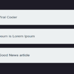
<p class="content">
<!-- Your paragraphs go here -->
Lorem ipsum dolor sit amet consectetur adipisicing elit. Et est id
consequuntur, aspernatur quisquam voluptates ullam quis delectus eveniet
consectetur deleniti distinctio sapiente! Ad sed eum nam facilis
dignissimos. Iusto voluptatem nemo, odit quasi laudantium voluptates ab
tempore suscipit delectus sapiente minus blanditiis eius fugit et debitis
nesciunt hic libero exercitationem repellat! Labore, laborum aperiam
quidem ipsam qui quasi maxime? Reiciendis excepturi accusamus dolores
quisquam rerum similique mollitia nobis nesciunt temporibus, minima
repellat eius veniam? Velit, explicabo. Consequuntur deserunt nemo sequi
quam placeat rerum. Nihil praesentium cupiditate officiis dicta at, id
fugit maxime ratione cum vel voluptatibus maiores error eum?
</p>
</body>
</html>HTML Breakdown:
- Viewport Configuration: The
<meta>tag ensures proper rendering on various devices by configuring the viewport. - Title: Sets the title of the web page to “Flash Light Effect.”
- Google Fonts Import: Imports the Poppins font from Google Fonts to enhance the typography.
- Body Styles: Defines basic styles for the body, including zero margin, padding, and the Poppins font.
- Content Styles: Styles for the content, adjusting font size, text alignment, line height, and padding.
- Flashlight Container: The
divelement with the classflashlightserves as the container for the flashlight effect. - Flashlight Pseudo-element: The
:beforepseudo-element creates the radial gradient that simulates the flashlight effect. Its position is absolute to cover the entire container. - Media Query: Adjusts the font size for smaller screens using a media query.
Unveiling the Flashlight Effect with JavaScript
let mouseX = 0;
let mouseY = 0;

let flashlight = document.getElementById("flashlight");
const isTouchDevice = () => {
  try {
    document.createEvent("TouchEvent");
    return true;
  } catch (e) {
    return false;
  }
};
function getMousePosition(e) {
  mouseX = !isTouchDevice() ? e.pageX : e.touches[0].pageX;
  mouseY = !isTouchDevice() ? e.pageY : e.touches[0].pageY;
  flashlight.style.setProperty("--Xpos", mouseX + "px");
  flashlight.style.setProperty("--Ypos", mouseY + "px");
}
document.addEventListener("mousemove", getMousePosition);
document.addEventListener("touchmove", getMousePosition);
JavaScript Explanation:
- Mouse Position Tracking: The
getMousePositionfunction tracks the mouse or touch input position and updates the--Xposand--YposCSS variables. - Touch Device Detection: The
isTouchDevicefunction checks whether the user’s device supports touch events. - Event Listeners: Two event listeners are added to the document, one for mouse movement (
mousemove) and another for touch movement (touchmove). These events trigger thegetMousePositionfunction.
Styling Magic with CSS
body {
  padding: 0;
  margin: 0;
  box-sizing: border-box;
  font-family: "Poppins", sans-serif;
  cursor: none;
}

.content {
  font-size: 1em;
  text-align: justify;
  line-height: 1.8em;
  padding: 0.2em;
}

.flashlight {
  --Xpos: 50vw;
  --Ypos: 50vh;
}

.flashlight:before {
  content: "";
  display: block;
  width: 100%;
  height: 100%;
  position: absolute;
  top: 0;
  pointer-events: none;
  background: radial-gradient(
    circle 9em at var(--Xpos) var(--Ypos),
    rgba(0, 0, 0, 0),
    rgba(0, 0, 0, 1)
  );
}

@media screen and (max-width: 500px) {
  body {
    font-size: 14px;
  }
}
CSS Highlights:
- Body Styles: Sets fundamental styles for the body, including zero padding, margin, and the Poppins font. Additionally, it hides the cursor using
cursor: none. - Content Styles: Defines styles for the content, adjusting font size, text alignment, line height, and padding.
- Flashlight Container Styles: Sets initial position variables for the flashlight effect.
- Flashlight Pseudo-element Styles: Utilizes a radial gradient to create the flashlight effect. The gradient is applied based on the mouse or touch input position.
- Media Query: Adjusts the font size for smaller screens using a media query.
Conclusion
In this blog post, we’ve uncovered the magic behind the flashlight effect, a captivating feature that follows the user’s cursor or touch input. By combining HTML, CSS, and a touch of JavaScript, you can create an immersive and visually engaging experience on your web page. Feel free to integrate and customize this effect in your projects, adding a touch of enchantment to your user interface.
Experiment, explore, and let your creativity shine!
Happy coding!