In web development, interactivity and user experience play pivotal roles in determining the success of a website or application. Today, we’ll delve into the creation of dynamic dropping radio buttons using HTML, CSS, and vanilla JavaScript. This interactive element will visually animate the selected radio button, offering users a delightful experience.
Explanation
HTML Structure
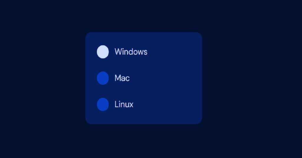
The HTML consists of a simple form with three radio buttons representing different operating systems: Windows, Mac, and Linux. Each radio button has a data-option attribute to identify its position.
<form>
	<label>
		<input type="radio" name="os" data-option="0" value="windows" checked>
		Windows
	</label>
	<label>
		<input type="radio" name="os" data-option="1" value="mac">
		Mac
	</label>
	<label>
		<input type="radio" name="os" data-option="2" value="linux">
		Linux
	</label>
</form>CSS Styling
The CSS provides a modern and responsive design, utilizing CSS custom properties for color theming and transitions for smooth animations.
* {
	border: 0;
	box-sizing: border-box;
	margin: 0;
	padding: 0;
}
:root {
	--hue: 223;
	--bg: hsl(var(--hue),90%,80%);
	--fg: hsl(var(--hue),90%,10%);
	--radio-off: hsl(var(--hue),90%,90%);
	--radio-on: hsl(var(--hue),90%,50%);
	--radio-down: hsl(var(--hue),90%,70%);
	--trans-dur: 0.3s;
	--trans-timing: cubic-bezier(0.65,0,0.35,1);
	font-size: calc(16px + (24 - 16) * (100vw - 320px) / (2560 - 320));
}
body,
input {
	color: var(--fg);
	font: 1em/1.5 "DM Sans", sans-serif;
	transition:
		background-color var(--trans-dur),
		color var(--trans-dur);
}
body {
	background-color: var(--bg);
	display: flex;
	height: 100vh;
}
form {
	background-color: hsl(0,0%,100%);
	border-radius: 0.75em;
	margin: auto;
	padding: 0.75em;
	min-width: 15em;
	transition: background-color var(--trans-dur);
}
label,
input[type="radio"] {
	cursor: pointer;
	-webkit-tap-highlight-color: transparent;
}
label {
	display: flex;
	align-items: center;
	padding: 0.75em 0.75em 0.75em 3em;
	position: relative;
}
input[type="radio"] {
	background-color: var(--radio-off);
	border-radius: 0.75em;
	outline: transparent;
	position: absolute;
	bottom: 0.75em;
	left: 0.75em;
	width: 1.5em;
	height: 1.5em;
	transition: background-color var(--trans-dur) var(--trans-timing);
	-webkit-appearance: none;
	appearance: none;
}
input[type="radio"]:checked {
	background-color: var(--radio-on);
}
input[type="radio"]:not(:checked):active {
	background-color: var(--radio-down);
}

/* Dark theme */
@media (prefers-color-scheme: dark) {
	:root {
		--bg: hsl(var(--hue),90%,10%);
		--fg: hsl(var(--hue),90%,90%);
		--radio-off: hsl(var(--hue),90%,40%);
		--radio-on: hsl(var(--hue),90%,90%);
		--radio-down: hsl(var(--hue),90%,60%);
	}
	form {
		background-color: hsl(var(--hue),90%,20%);
	}
}- Global Reset: Resets default styles and sets the box-sizing to border-box.
- Custom Properties: Defines various HSL values for background, foreground, and radio button colors.
- Responsive Font Size: Adjusts font size based on viewport width for better readability.
- Form Styling: Styles the form, labels, and radio buttons with transitions and animations.
Dark Theme
A dark theme is also included, adapting the color scheme based on the user’s preference using the prefers-color-scheme media query.
JavaScript Interactivity
The JavaScript code utilizes the Web Animations API to create dynamic animations when a radio button is selected. The DroppingRadioButtons class handles the animation logic:
window.addEventListener("DOMContentLoaded", () => {
    const c = new DroppingRadioButtons("form");
});

class DroppingRadioButtons {
    optionID = null;
    optionAAnim = null;
    optionBAnim = null;

    constructor(el) {
        this.el = document.querySelector(el);
        this.el.addEventListener("change", this.updateOption.bind(this));
    }

    updateOption(e) {
        const nextOption = +e.target.getAttribute("data-option");
        if (this.optionID !== null) {
            this.animateOption(this.optionID, nextOption);
        }
        this.optionID = nextOption;
    }

    animateOption(optionA, optionB) {
        const diff = Math.abs(optionA - optionB);
        const optionAEl = this.el.querySelector(`[data-option="${optionA}"]`);
        const optionBEl = this.el.querySelector(`[data-option="${optionB}"]`);
        const ALessThanB = optionA < optionB;
        const dropColor = `var(--radio-${ALessThanB ? "on" : "off"})`;
        const inchColor = `var(--radio-${ALessThanB ? "off" : "on"})`;

        const dropKeyframes = [
            { backgroundColor: dropColor, transform: `translateY(0)`, zIndex: 1 },
            { backgroundColor: dropColor, transform: `translateY(0)`, zIndex: 1, offset: 0.4, easing: "cubic-bezier(0.32,0,0.67,0)" },
            { backgroundColor: dropColor, transform: `translateY(${3 * diff}em)`, zIndex: 1, offset: 0.5, easing: "cubic-bezier(0.32,1,0.67,1)" },
            { backgroundColor: dropColor, transform: `translateY(${2.5 * diff}em)`, zIndex: 1, offset: 0.6, easing: "cubic-bezier(0.32,0,0.67,0)" },
            { backgroundColor: dropColor, transform: `translateY(${3 * diff}em)`, zIndex: 1, offset: 0.7 },
            { backgroundColor: dropColor, transform: `translateY(${3 * diff}em)`, zIndex: 1 }
        ];

        const inchUpKeyframes = [
            { backgroundColor: inchColor, height: `1.5em`, bottom: `0.75em` },
            { backgroundColor: inchColor, height: `${1.5 + 3 * diff}em`, bottom: `0.75em`, offset: 0.1 },
            { backgroundColor: inchColor, height: `${1.5 + 3 * diff}em`, bottom: `0.75em`, offset: 0.9 },
            { backgroundColor: inchColor, height: `1.5em`, bottom: `${0.75 + 3 * diff}em` }
        ];

        const duration = 900;
        const bezier = "cubic-bezier(0.65,0,0.35,1)";
        const optionAConfig = { duration };
        const optionBConfig = { duration };

        if (ALessThanB) {
            optionBConfig.easing = bezier;
        } else {
            optionAConfig.easing = bezier;
        }

        this.optionAAnim?.cancel();
        this.optionAAnim = optionAEl.animate(ALessThanB ? dropKeyframes : inchUpKeyframes, optionAConfig);
        this.optionBAnim?.cancel();
        this.optionBAnim = optionBEl.animate(ALessThanB ? inchUpKeyframes : dropKeyframes, optionBConfig);
    }
}- Constructor: Initializes the class and attaches an event listener to the form’s change event.
- updateOption: Updates the selected option and triggers the animation.
- animateOption: Defines the keyframes and animation configurations based on the selected options, animating the radio buttons’ movement.
Conclusion
Creating dynamic and interactive UI elements like dropping radio buttons can significantly enhance user engagement and satisfaction. By combining HTML for structure, CSS for styling, and JavaScript for interactivity, we’ve crafted an intuitive and visually appealing component that not only serves its functional purpose but also elevates the overall user experience.
Feel free to integrate this component into your projects, customize the styling and animations to match your design language, and explore further possibilities to innovate and delight your users.
Remember, the key to successful web development lies in continuous learning, experimentation, and iteration based on user feedback and evolving design trends.
Happy coding!