Introduction
The Animated Fan showcased in this guide combines HTML, CSS, and JavaScript to create a visually engaging fan animation. By understanding the code structure and its underlying concepts, you can gain insights into building interactive and dynamic elements for your web projects. Let’s embark on a journey through the intricacies of this fan animation.
HTML Structure
<!DOCTYPE html>
<html lang="en">
<head>
<meta charset="UTF-8" />
<meta name="viewport" content="width=device-width, initial-scale=1.0" />
<title>Rotating Fan</title>
</head>
<body>
<div class="main">
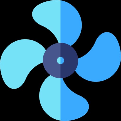
<img id="img" src="fan.jpeg" alt="" srcset="" /> <br />
<br />
<button onclick="myfunon()">ON</button>
<button onclick="myfunoff()">OFF</button>
<button onclick="myfun2()">1</button>
<button onclick="myfun3()">2</button>
<button onclick="myfun4()">3</button>
</div>
</body>
</html>HTML Highlights:
- Main Container: Contains the fan image and control buttons.
- Fan Image: Displayed using the
<img>tag. - Control Buttons: Trigger JavaScript functions for animation control.
CSS Styling
* {
  margin: 0;
  padding: 0;
  box-sizing: border-box;
}
body {
  height: 100vh;
  display: flex;
  align-items: center;
  justify-content: center;
  background-color: #1e1c27;
}
img {
  border: 20px solid aqua;
  padding: 50px;
  border-radius: 50%;
  animation: fananim linear infinite;
}
@keyframes fananim {
  100% {
    transform: rotate(360deg);
  }
}
button {
  width: 100px;
  height: 100px;
  padding: 20px 30px;
  margin: 0 20px;
  font-size: 25px;
  font-weight: 550;
  border: none;
  background-color: silver;
  border-radius: 50%;
  transition: 0.1s;
}
.main button:nth-last-child(5) {
  background-color: rgb(0, 255, 0);
}
.main button:nth-last-child(4) {
  background-color: red;
}
button:active {
  box-shadow: 0px 10px 10px black;
  transform: scale(0.95);
}
CSS Highlights:
- Global Styles: Set up the background color and flex display for the body.
- Fan Image Styles: Apply border, padding, and animation for the fan.
- Animation Keyframes: Rotate the fan 360 degrees for a complete cycle.
- Button Styles: Define dimensions, padding, and transition properties.
- Color Variation: Customize button colors based on their position.
JavaScript Logic
let a = document.getElementById("img");
function myfunon() {
  a.style.animationDuration = 3 + "s";
}
function myfunoff() {
  a.style.animationDuration = 0 + "s";
}
function myfun2() {
  a.style.animationDuration = 1 + "s";
}
function myfun3() {
  a.style.animationDuration = 0.5 + "s";
}
function myfun4() {
  a.style.animationDuration = 0.1 + "s";
}
JavaScript Highlights:
- Animation Control Functions: Adjust the animation duration based on button clicks.
- Dynamic Interaction: Modify the animation speed dynamically for user interaction.
Key Concepts
- Fan Animation with Keyframes: The
@keyframesrule defines a smooth 360-degree rotation for the fan, creating a visually appealing effect. - Button Interactivity: JavaScript functions (
myfunon,myfunoff, etc.) enable users to control the fan animation by adjusting its speed. - Dynamic Animation Duration: JavaScript dynamically modifies the animation duration, allowing users to experience different speeds.
- Button Styling and Interaction: CSS styles provide an aesthetic appeal to control buttons, with variations in color and interactive effects on click.
Conclusion
This guide serves as a gateway to understanding the creation of an Animated Fan using HTML, CSS, and JavaScript. By exploring the code and concepts presented, you can gain valuable insights into building interactive and visually striking elements for your web projects.
Feel free to experiment with the provided code, tweak styles, or enhance functionality to suit your specific needs. Let the Animated Fan serve as inspiration for your journey into the dynamic world of web development.
Happy coding!


Good explanation sir