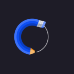
Introduction: Tab bars are essential components of modern web applications, providing users with easy navigation between different sections or pages. In this tutorial, we’ll delve into the process of crafting a custom tab bar featuring captivating animated icons using standard web technologies: HTML, CSS, and JavaScript. This tutorial aims to equip you with the skills to design an engaging and user-friendly tab bar for your web projects.
Latest Posts:
- One-Stop JavaScript Frontend Interview Notes [2026]
- Crack Any Job Interview with These Aptitude Topics – Download Handwritten Notes for Free!
- Master Data Structures and Algorithms with These 75 Handpicked Questions (With Free PDF Download)
- Unlock Your Tech Career: GeeksforGeeks Launches Limited-Time Free Courses!
- The Ultimate 127 DSA Patterns to Replace 3000+ Random Questions
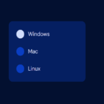
HTML Structure: At the core of our custom tab bar lies semantic HTML, ensuring accessibility and compatibility across various devices and screen readers. The HTML structure comprises a <nav> element housing an unordered list (<ul>) containing individual tab items (<li>). Each tab item encapsulates an anchor (<a>) element housing an SVG icon and a descriptive text label.
<nav class="custom-tab-bar">
    <ul class="custom-tab-bar__tabs">
        <li class="custom-tab-bar__tab">
            <a class="custom-tab-bar__tab-link" href="#home" aria-current="page">
                <svg class="custom-tab-bar__tab-icon custom-tab-bar__tab-icon--home" viewBox="0 0 24 24" width="24px" height="24px" aria-hidden="true">
                    <g class="custom-tab-bar__tab-icon-1" fill="var(--focus-t)" stroke="currentColor" stroke-width="2" stroke-linejoin="round">
                        <polygon points="12 1,23 10,23 23,16 23,16 14,8 14,8 23,1 23,1 10" />
                    </g>
                </svg>
                <span class="custom-tab-bar__tab-name">Home</span>
            </a>
        </li>
        <li class="custom-tab-bar__tab">
            <a class="custom-tab-bar__tab-link" href="#videos">
                <svg class="custom-tab-bar__tab-icon custom-tab-bar__tab-icon--videos" viewBox="0 0 24 24" width="24px" height="24px" aria-hidden="true">
                    <g fill="var(--focus-t)" stroke="currentColor" stroke-width="2" stroke-linecap="round" stroke-linejoin="round">
                        <line class="custom-tab-bar__tab-icon-1" x1="3" y1="1" x2="21" y2="1" />
                        <line x1="2" y1="5" x2="22" y2="5" />
                        <g class="custom-tab-bar__tab-icon-2" transform="translate(1,9)">
                            <polygon points="9 3,15 7.5,9 11" />
                            <rect rx="2" ry="2" width="22" height="14" />
                            <polygon class="custom-tab-bar__tab-icon-3" opacity="0" points="9 3,15 7.5,9 11" />
                        </g>
                    </g>
                </svg>
                <span class="custom-tab-bar__tab-name">Videos</span>
            </a>
        </li>
        <li class="custom-tab-bar__tab">
            <a class="custom-tab-bar__tab-link" href="#books">
                <svg class="custom-tab-bar__tab-icon custom-tab-bar__tab-icon--books" viewBox="0 0 24 24" width="24px" height="24px" aria-hidden="true">
                    <g class="custom-tab-bar__tab-icon-1" fill="var(--focus-t)" stroke="currentColor" stroke-width="2" stroke-linecap="round" stroke-linejoin="round">
                        <rect class="custom-tab-bar__tab-icon-2" x="1" y="1" rx="2" ry="2" width="11" height="19" />
                        <rect class="custom-tab-bar__tab-icon-3" x="12" y="1" rx="2" ry="2" width="11" height="19" />
                        <line x1="12" y1="21" x2="12" y2="23" />
                    </g>
                </svg>
                <span class="custom-tab-bar__tab-name">Books</span>
            </a>
        </li>
        <li class="custom-tab-bar__tab">
            <a class="custom-tab-bar__tab-link" href="#profile">
                <svg class="custom-tab-bar__tab-icon custom-tab-bar__tab-icon--profile" viewBox="0 0 24 24" width="24px" height="24px" aria-hidden="true">
                    <g fill="var(--focus-t)" stroke="currentColor" stroke-width="2">
                        <circle class="custom-tab-bar__tab-icon-1" cx="12" cy="6.5" r="5.5"/>
                        <path d="M20.473,23H3.003c-1.276,0-2.228-1.175-1.957-2.422,.705-3.239,3.029-8.578,10.693-8.578s9.987,5.336,10.692,8.575c.272,1.248-.681,2.425-1.959,2.425Z"/>
                    </g>
                </svg>
                <span class="custom-tab-bar__tab-name">Profile</span>
            </a>
        </li>
    </ul>
</nav>CSS Styling: Cascading Style Sheets (CSS) play a pivotal role in defining the visual aesthetics and responsiveness of our custom tab bar. Leveraging CSS, we meticulously style the tab bar, setting parameters such as background color, border radius, and box shadow. The use of CSS variables facilitates seamless customization, enabling developers to effortlessly tweak colors and transitions to align with their project’s design language.
@mixin custom-debug-hitbox() {
    $debug: false;

    @if $debug == true {
        $hue: floor(360 * random());
        outline: 1px solid hsl($hue,90%,50%);
    }
}

* {
    border: 0;
    box-sizing: border-box;
    margin: 0;
    padding: 0;
}

:root {
    --hue: 223;
    --bg: hsl(var(--hue),10%,90%);
    --fg: hsl(var(--hue),10%,10%);
    --focus: hsl(var(--hue),90%,50%);
    --focus-t: hsla(var(--hue),90%,50%,0);
    --custom-tab-bar-bg: hsl(0,0%,100%);
    --trans-dur: 0.3s;
    --trans-timing: cubic-bezier(0.65,0,0.35,1);
    font-size: calc(14px + (30 - 14) * (100vw - 280px) / (3840 - 280));
}

body {
    background-color: var(--bg);
    color: var(--fg);
    display: flex;
    font: 1em/1.5 "Noto Sans", sans-serif;
    height: 100vh;
    transition:
        background-color var(--trans-dur),
        color var(--trans-dur);
}

.custom-tab-bar {
    background-color: var(--custom-tab-bar-bg);
    border-radius: 2em;
    box-shadow: 0 0 0.75em hsla(var(--hue),10%,10%,0.1);
    margin: auto;
    width: calc(100% - 1.5em);
    max-width: 27em;
    transition:
        background-color var(--trans-dur),
        box-shadow var(--trans-dur);

    &__tabs {
        @include custom-debug-hitbox();
        display: flex;
        justify-content: space-between;
        list-style: none;
    }

    &__tab {
        @include custom-debug-hitbox();
        text-align: center;
        width: 100%;

        &-icon,
        &-name {
            display: block;
            pointer-events: none;
            transition:
                opacity var(--trans-dur) var(--trans-timing),
                transform var(--trans-dur) var(--trans-timing);
        }

        &-icon {
            @include custom-debug-hitbox();
            margin: auto;
            overflow: visible;
            width: 1.5em;
            height: auto;

            circle,
            path,
            polygon,
            rect {
                transition:
                    fill calc(var(--trans-dur) / 2) var(--trans-timing),
                    opacity calc(var(--trans-dur) / 2) var(--trans-timing),
                    stroke calc(var(--trans-dur) / 2) var(--trans-timing),
                    transform var(--trans-dur) var(--trans-timing);
            }

            &-1,
            &-2,
            &-3 {
                animation: {
                    duration: calc(var(--trans-dur) * 2.5);
                    timing-function: ease-in-out;
                }
            }

            &--home &-1 {
                transform-origin: 12px 24px;
            }

            &--videos &-3 {
                fill: var(--custom-tab-bar-bg);
                stroke: var(--custom-tab-bar-bg);
            }

            &--books &-2,
            &--books &-3 {
                transform-origin: 12px 21px;
            }
        }

        &-name {
            @include custom-debug-hitbox();
            font: {
                size: 0.75em;
                weight: 500;
            };
            line-height: 1;
            top: calc(100% - 0.5rem);
            opacity: 0;
            overflow: hidden;
            position: absolute;
            text-overflow: ellipsis;
            white-space: nowrap;
            width: 100%;
        }

        &-link {
            @include custom-debug-hitbox();
            color: var(--fg);
            display: flex;
            position: relative;
            text-decoration: none;
            width: 100%;
            height: 5.5em;
            transition: color calc(var(--trans-dur) / 2);
            -webkit-tap-highlight-color: transparent;

            &:hover,
            &:focus-visible {
                color: var(--focus);
            }
        }

        &-link[aria-current="page"] {
            color: var(--focus);
        }

        &-link[aria-current="page"] &-icon {
            transform: translateY(-50%);

            circle,
            path,
            polygon,
            rect {
                fill: var(--focus);
            }
        }

        &-link[aria-current="page"] &-name {
            opacity: 1;
            transform: translateY(-200%);
        }

        &-link[aria-current="page"] &-icon--home &-icon-1 {
            animation-name: home-bounce;
        }

        &-link[aria-current="page"] &-icon--videos &-icon-1 {
            animation-name: video-move-1;
        }

        &-link[aria-current="page"] &-icon--videos &-icon-2 {
            animation-name: video-move-2;
        }

        &-link[aria-current="page"] &-icon--videos &-icon-3 {
            animation-name: video-fade-slide;
            opacity: 1;
            fill: var(--custom-tab-bar-bg);
        }

        &-link[aria-current="page"] &-icon--books &-icon-1 {
            animation-name: books-move;
        }

        &-link[aria-current="page"] &-icon--books &-icon-2 {
            animation-name: books-scale-left;
        }

        &-link[aria-current="page"] &-icon--books &-icon-3 {
            animation-name: books-scale-right;
        }

        &-link[aria-current="page"] &-icon--profile &-icon-1 {
            animation-name: profile-head-bob;
        }
    }

    [data-pristine] &__tab {
        &-icon {
            &-1,
            &-2,
            &-3 {
                animation: {
                    duration: 0s;
                }
            }
        }
    }
}

/* Dark theme */
@media (prefers-color-scheme: dark) {
    :root {
        --bg: hsl(var(--hue),10%,30%);
        --fg: hsl(var(--hue),10%,90%);
        --focus: hsl(var(--hue),90%,60%);
        --focus-t: hsla(var(--hue),90%,60%,0);
        --custom-tab-bar-bg: hsl(var(--hue),10%,10%);
    }

    .custom-tab-bar {
        box-shadow: 0 0 0.75em hsla(var(--hue),10%,10%,0.3);
    }
}

/* Animations */
@media (prefers-reduced-motion) {
    .custom-tab-bar {
        &__tab {
            &-icon {
                &-1,
                &-2,
                &-3 {
                    animation: {
                        duration: 0s;
                    }
                }
            }
        }
    }
}

@keyframes home-bounce {
    from,
    to {
        transform: scale(1,1) translateY(0);
    }

    20% {
        transform: scale(1.5,0.75) translateY(0);
    }

    40% {
        transform: scale(0.8,1.2) translateY(-4px);
    }

    60% {
        transform: scale(1.1,0.9) translateY(0);
    }

    80% {
        transform: scale(0.95,1.05) translateY(0);
    }
}

@keyframes video-move-1 {
    from,
    to {
        transform: translate(0,0);
    }

    20%,
    80% {
        transform: translate(0,4px);
    }
}

@keyframes video-move-2 {
    from,
    to {
        transform: translate(1px,9px);
    }

    20%,
    80% {
        transform: translate(1px,5px);
    }
}

@keyframes video-fade-slide {
    from {
        animation-timing-function: steps(1,end);
        opacity: 0;
        transform: translate(0,0);
    }

    40% {
        animation-timing-function: ease-out;
        opacity: 1;
        stroke: hsla(0,0%,0%,0);
        transform: translate(-4px,0);
    }

    60%,
    to {
        opacity: 1;
        stroke: var(--custom-tab-bar-bg);
        transform: translate(0,0);
    }
}

@keyframes books-move {
    from,
    60%,
    to {
        transform: translateY(0);
    }

    20% {
        transform: translateY(-1px);
    }

    40% {
        transform: translateY(0.5px);
    }
}

@keyframes books-scale-left {
    from,
    to {
        transform: skewY(0);
    }

    20% {
        transform: skewY(-16deg);
    }

    40% {
        transform: skewY(12deg);
    }

    60% {
        transform: skewY(-8deg);
    }

    80% {
        transform: skewY(4deg);
    }
}

@keyframes books-scale-right {
    from,
    to {
        transform: skewY(0);
    }

    20% {
        transform: skewY(16deg);
    }

    40% {
        transform: skewY(-12deg);
    }

    60% {
        transform: skewY(8deg);
    }

    80% {
        transform: skewY(-4deg);
    }
}

@keyframes profile-head-bob {
    from,
    to {
        transform: translateX(0);
    }

    20% {
        transform: translateX(4px);
    }

    40% {
        transform: translateX(-3px);
    }

    60% {
        transform: translateX(2px);
    }

    80% {
        transform: translateX(-1px);
    }
}JavaScript Functionality: To infuse interactivity into our tab bar, JavaScript comes into play. Through event delegation, we attach an event listener to the tab bar, monitoring click events on tab links. Upon user interaction, the corresponding tab is highlighted by dynamically adding the aria-current attribute, ensuring clarity and accessibility for users, particularly those reliant on screen readers.
window.addEventListener("DOMContentLoaded", function () {
  var customTabBar = new CustomTabBar("nav.custom-tab-bar");
});
function CustomTabBar(el) {
  this.el = document.querySelector(el);
  this.el.setAttribute("data-pristine", "true");
  this.el.addEventListener("click", this.switchTab.bind(this));
}
CustomTabBar.prototype.switchTab = function (e) {
  this.el.removeAttribute("data-pristine");
  var target = e.target;
  var href = target.getAttribute("href");
  if (href) {
    var currentPage = this.el.querySelector('[aria-current="page"]');
    if (currentPage) {
      currentPage.removeAttribute("aria-current");
    }
    target.setAttribute("aria-current", "page");
  }
};Animations: What sets our custom tab bar apart are the captivating animations adorning each icon, lending a touch of dynamism and flair to the user experience. Utilizing CSS keyframe animations, we orchestrate an array of visual effects, from subtle bounces to elegant slides, elevating the tab bar’s aesthetic appeal and engagement quotient.
Conclusion: In conclusion, embarking on the journey of crafting a bespoke custom tab bar with animated icons offers a rewarding opportunity to enhance user navigation and engagement within your web applications. By adhering to best practices in HTML semantics, CSS styling, and JavaScript functionality, coupled with judicious use of animations, you can create a truly immersive and delightful user experience that resonates with your audience.
This tutorial serves as a comprehensive guide, equipping you with the knowledge and skills necessary to conceptualize, design, and implement a custom tab bar tailored to your project’s unique requirements. Embrace creativity, experiment with animations, and unlock the full potential of your web applications with a custom tab bar that captivates and delights users.
Happy Coding!